The Feed Doesn't Reward Polite: How Playing It Safe Made Your Brand Invisible
There's a particular kind of brand image you've seen a thousand times today alone. The smiling woman in a beige blazer, holding a laptop, laughing at nothing. The product floating on a gradient. The team standing in a bright office, arms crossed, radiating the exact energy of a dentist's waiting room.
It's fine. It's clean. It's forgettable. And in 2025, forgettable is the most expensive thing a brand can buy.
The Scroll Is a Firing Squad
The average American spends over two hours a day in social feeds, and the platforms have gotten terrifyingly good at predicting what we'll skip. Content that looks like everything else gets treated like everything else — swiped past in under a second. Eye-tracking studies from agencies like Nebo and data out of social analytics firms have shown time and again that images which break a feed's visual pattern hold attention measurably longer. We're talking dwell time jumps of 20 to 40 percent when an image disrupts what the viewer expected to see.
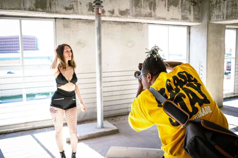
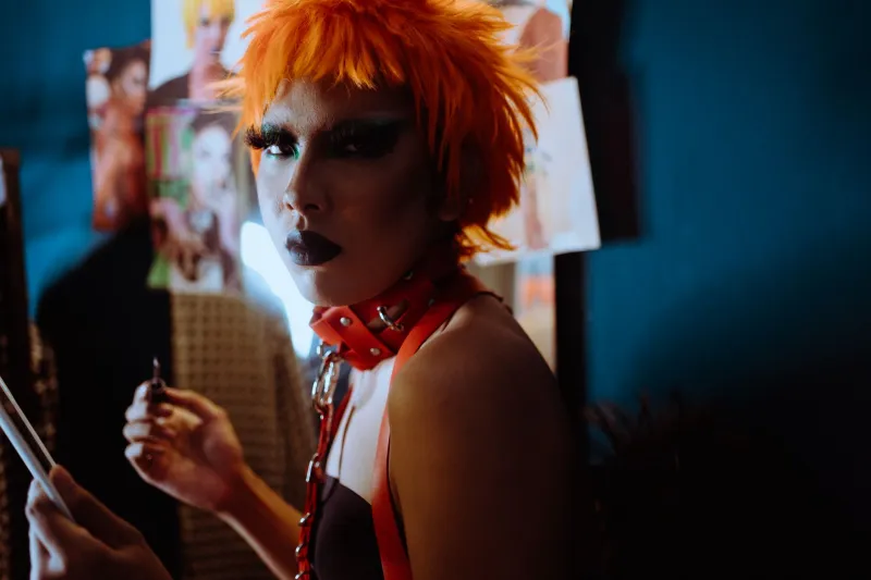
Think about what that means practically. If your competitor posts a moody, grainy, flash-blasted portrait and you post a bright, sanitized lifestyle shot, the algorithm doesn't care which one is 'professional.' It cares which one stopped a thumb. Increasingly, it's not the polished one.
Glossy Perfection Started Reading as a Lie
Something shifted culturally after the pandemic and through the AI image boom. Audiences — especially Gen Z and younger millennials, who now hold serious purchasing power in the US — developed a kind of perfection radar. Overly smooth skin, impossible lighting, staged laughter: it all triggers the same instinct as a scam email. This isn't real. Move along.*
Meanwhile, the brands leaning into raw, defiant imagery are eating. Look at what Liquid Death did with canned water — shot like a hardcore album cover, treated like a punk band, and it turned a commodity into a billion-dollar valuation. Look at how Ryanair built one of the most-followed airline accounts on earth partly by refusing to look like an airline. Even legacy players are catching on: Duolingo's chaotic mascot content and Stanley's scrappy, community-driven cup craze both beat the old playbook of immaculate corporate polish.
None of these brands won because their photos were technically perfect. They won because their photos had an attitude.
What Art Directors Are Actually Saying
We talked to a few working art directors and creative leads across the country, and the consensus is blunt. One, who's shot campaigns for outdoor brands in Denver, put it this way: 'Clients used to ask for aspirational. Now they ask for real — but real with a point of view. The imperfect stuff converts because it looks like a person made it, not a committee.'
Another, working in fashion e-comm in LA, told us her highest-performing product images last quarter were the 'worst' ones — direct flash, harsh shadows, a slightly crooked frame. 'The polished renders got saved. The raw shots got shared. Sharing is the whole game.'
That tracks with broader engagement data. UGC-style and lo-fi content consistently outperforms studio gloss on platforms like TikTok and Instagram Reels, and brands that mix defiant editorial imagery into their feeds report stronger comment activity and higher click-through to product pages. Attention first, trust second, conversion third. Perfection stalls the whole chain.
The Risk Calculation Has Flipped
Here's the part that should keep CMOs up at night. For decades, the safe choice was also the cheap choice emotionally — nobody gets fired for beige. But the math changed. When everyone has access to the same stock libraries and the same AI generators, 'safe' doesn't mean low-risk anymore. It means identical. And identical means invisible.
The actual risk in 2025 is being skipped. Every polished, interchangeable image you publish trains your audience to scroll past you. Every bold, weird, specific image trains them to stop.
How to Start Breaking Your Own Rules
You don't need a massive budget to opt out of invisibility. You need conviction and a few deliberate choices:
- Kill the stock habit. If an image could appear on any competitor's site without anyone noticing, it's not your image.
- Give your photographer a point of view, not a shot list. Brief them on the feeling you want — defiant, gritty, alive — and let them bring technique to match.
- Embrace the flaws that signal a human. Grain, harsh light, off-kilter framing, a real location instead of a seamless backdrop.
- Test against yourself. Run a bold image head-to-head with a safe one. Watch the numbers. Most brands we've seen try this never go back.
The brands refusing to blend in aren't being reckless. They've simply done the math the rest of the market hasn't caught up to yet. In a feed economy, the safest-looking thing on screen is the one guaranteed to be ignored. Safe isn't neutral anymore. Safe is invisible — and invisible doesn't sell.