Smoke Rings and Scars: What Brands Really Mean When They Ask for 'Vintage'
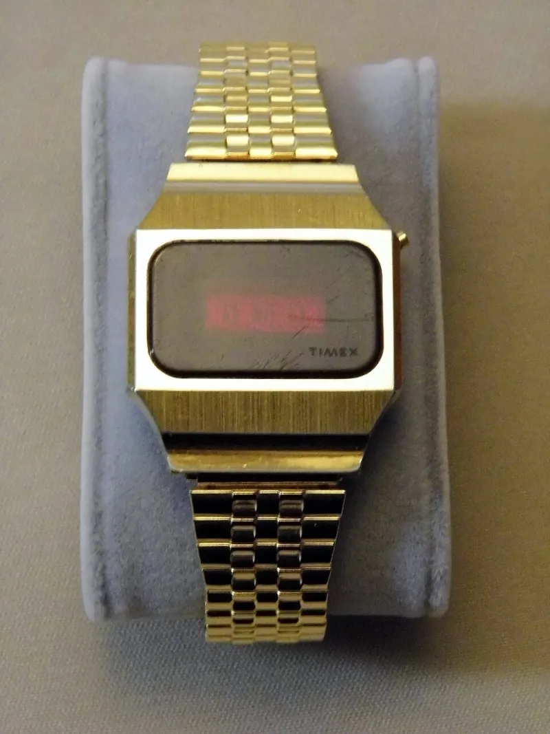
Photo: Joe Haupt from USA, CC BY-SA 2.0, via Wikimedia Commons
There's a moment every photographer and creative director in this country knows by heart. The client says the word — vintage — and everyone in the room nods. They want warmth. Grain. A little nostalgia for the good old days. Then you show them the contact sheet. Actual period-accurate lighting, the kind that came from a single bare bulb and a cigarette hanging off the set designer's lip. Skin with pores. Teeth that haven't met a whitening strip. A color palette that looks like a Motel 6 in 1974, because it was. And the client's face does the thing. The slow drain. The quiet, "Hmm, can we brighten it up a little?"
That's the moment you learn the truth: they never wanted vintage. They wanted a postcard of vintage, printed on modern gloss, airbrushed of everything that made the era worth romanticizing in the first place.
The Theme-Park Past
What most American brands mean by "retro" is a Disneyland Main Street version of history — all the silhouette, none of the smell. It's the 1950s with the segregation quietly cropped out. The 1970s with the smoking and the lead paint and the economic malaise sanded off. The 1980s reduced to neon grids and synthwave, as if the decade didn't also give us Reagan-era anxieties and rust-belt decay.
This isn't an accident. Sanitized nostalgia is a product. It's easier to sell a Corvette next to. Real history is messy, and mess makes marketing departments break out in hives. So the brief says "authentic" while the mood board says "Instagram filter that mimics authenticity."
And look — I get the instinct. Nobody's asking a mid-size brand out of Dayton to recreate the hard truths of the American century in a 30-second spot. But there's a difference between respecting an era and shrink-wrapping it. One is homage. The other is a wax figure.
The Flaws Were the Look
Here's the thing the panic-moment clients never understand: the imperfections they want removed are literally what made old photography look old. The halation in a Kodachrome slide. The blown highlights from a flash bulb. The soft focus that came from cheap glass, not a Photoshop plugin. The yellowed cast of a print that sat in a shoebox for forty years while somebody's mom moved three times across the Midwest.
You cannot have the texture without the texture. Strip out the grain, the haze, the honest skin, and you don't have a vintage photograph — you have a modern photograph wearing a costume. Audiences can smell the difference instantly. Gen Z especially. They've grown up fluent in fake, and they scroll right past anything that smells like a set dressed by someone who learned the era from a streaming show.
The brands that actually win with retro work — the ones whose campaigns get screenshotted and shared — are the ones who let the past be ugly. Who let a diner scene be a little too dim. Who let the model's freckles survive the retouch. Who understood that a photograph from 1962 was never supposed to look clean, because 1962 wasn't clean.
Pushing Back Without Losing the Job
So how do you fight for the real thing without turning the kickoff call into a hostage situation? A few moves that have kept me employed:
Show the source material early. Don't wait until the shoot's wrapped to reveal what real vintage looks like. Put actual period photography in front of the client in the first meeting — the unvarnished stuff, not the curated Pinterest board. Let them flinch in the conference room instead of on delivery day.
Name the fear. Usually the resistance isn't aesthetic, it's legal and reputational. "Will people think we endorse smoking?" Maybe have that conversation explicitly. Sometimes once the fear is spoken out loud, it shrinks.
Compromise on set, not in post. If they need it brighter, add a practical light on set. If they need the mood lifted, change wardrobe and props. The moment you fix things in the edit, you're not making a vintage photograph anymore — you're making a modern one with a sepia wash, and everybody involved should admit that out loud.
Know which battles pay you. Some clients will never let a tooth be crooked. Take the job, do your best work inside their cage, and save your rebellion for the clients who asked for it. Not every brief is a revolution. Some briefs are just rent.
The Case for Letting the Past Be Ugly
America's actual visual history is richer, stranger, and more beautiful than any mood board gives it credit for. The hand-tinted portraits from county fairs. The harsh flash of a roadside neon sign at 2 a.m. The Polaroid that didn't develop right and became the only photo anyone kept. These images endure precisely because they're imperfect — because they carry evidence of the human hands and cheap machines that made them.
When a brand sandblasts that evidence away, they're not honoring the past. They're embalming it. And embalmed imagery doesn't connect with anyone; it just sits in the campaign like a mannequin at a museum.
So the next time the brief says "vintage" and the room says "but softer," consider this your permission slip: push back. Show them the smoke. Show them the scars. Show them the real thing, and then show them how much louder the real thing looks in a feed full of plastic nostalgia.
The past wasn't sanitized. That's why we're still looking at it.